Zulma Pures
Project details
- Solution
- Branding
- Industry
- Health and wellness
- Deliverables
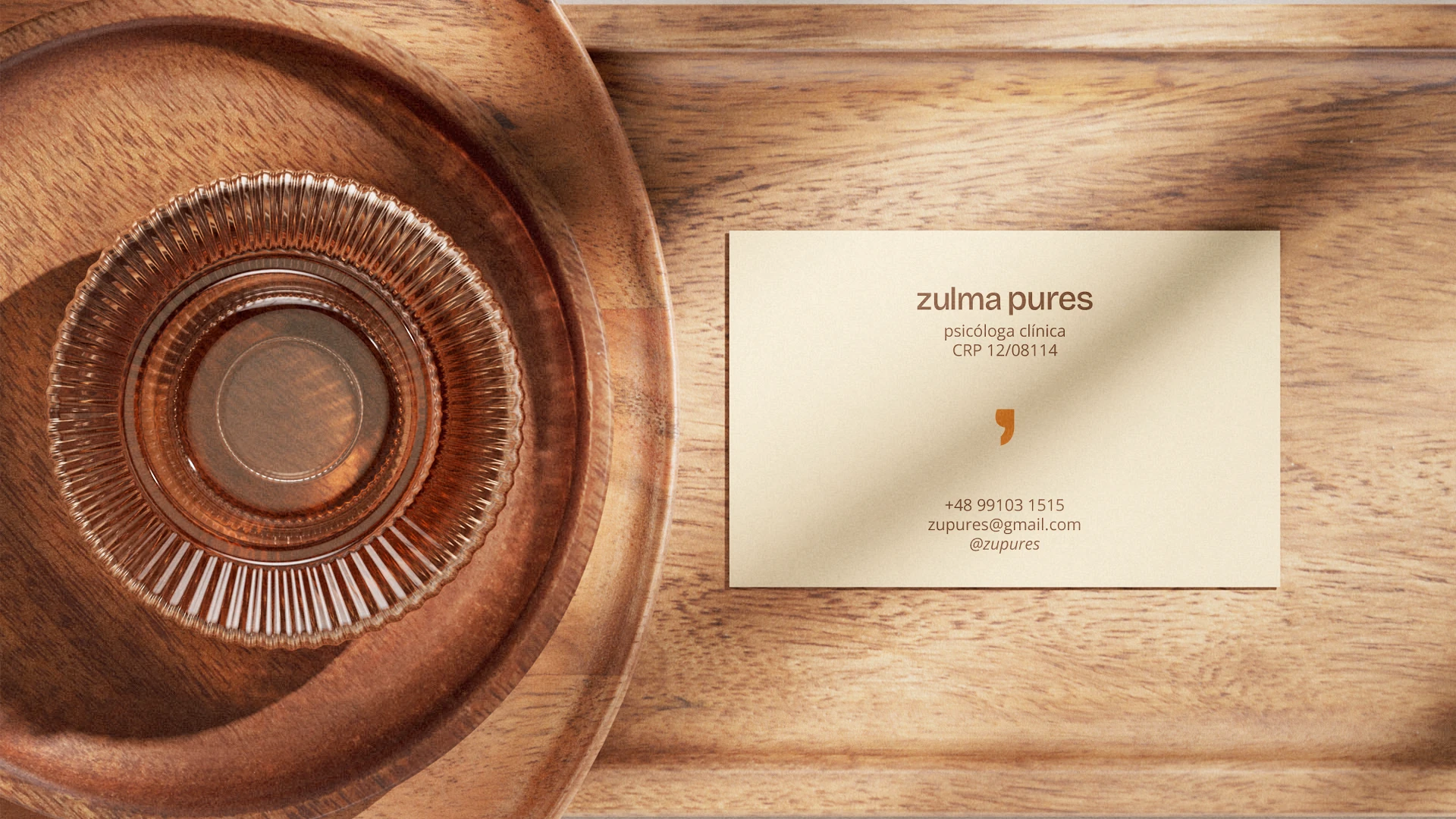
- Logo design, Visual identity system, Stationery, Social media
- Timeline
- 3 weeks
Challenge
Psychologist Zulma Pures needed a personal brand that combined youthfulness with clinical credibility. We created a sensitive, contemporary visual identity built on the concept of continuity, capturing the warmth and care of therapy.
In the crowded field of clinical psychology, building a strong personal brand often runs into visual clichés, swinging between the coldness of medical settings and worn-out symbols. Psychologist Zulma Pures came to Fracto with a complex positioning challenge: she needed a visual identity that reflected her true essence, young and spontaneous, without ever compromising the seriousness, credibility and depth that therapeutic practice requires.
Our core strategic challenge was to find the meeting point between the lightness of her human-centered approach and the rigor of a mental health professional. We needed to avoid the obvious and design a visual system that, from the very first touchpoint, conveyed a truly safe, empathetic and dynamic environment, building trust and preparing patients for the journey before their first session.
Solution
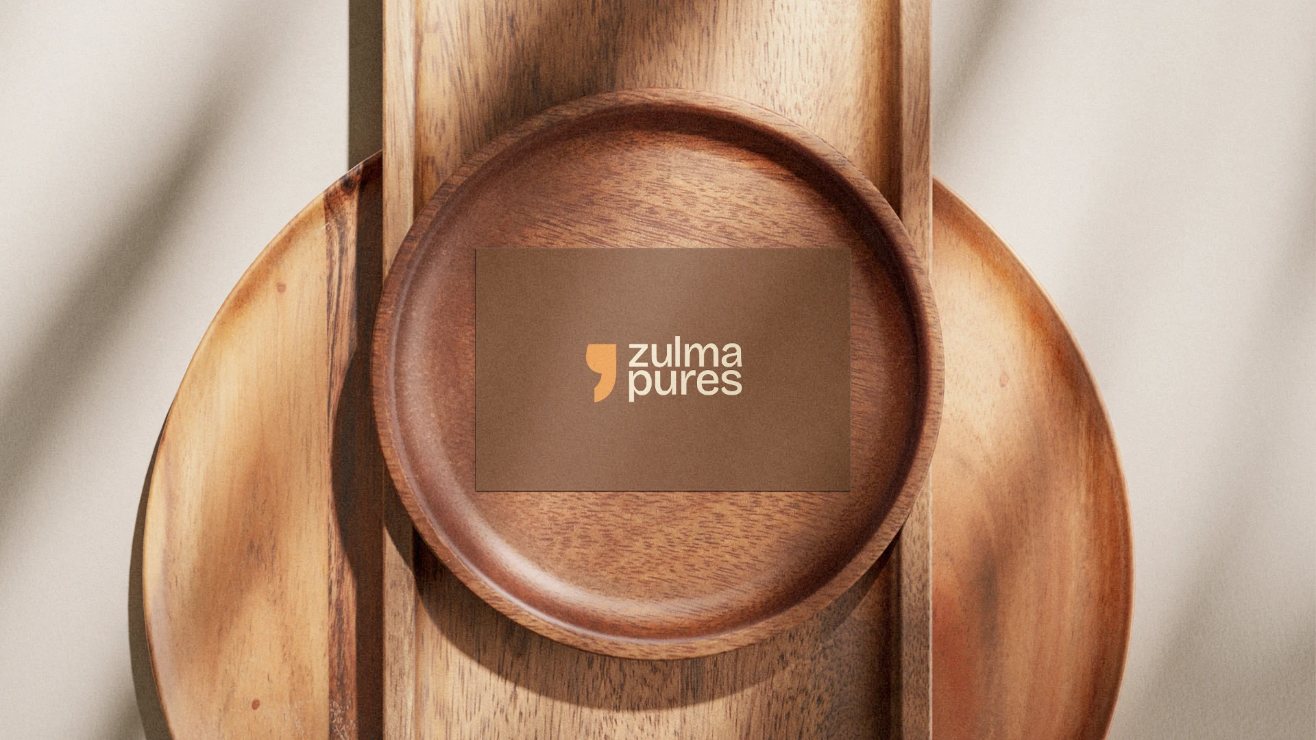
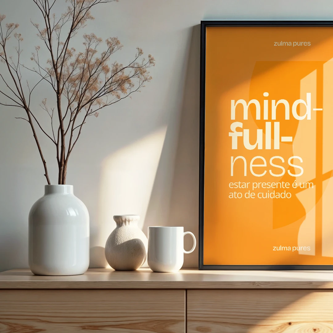
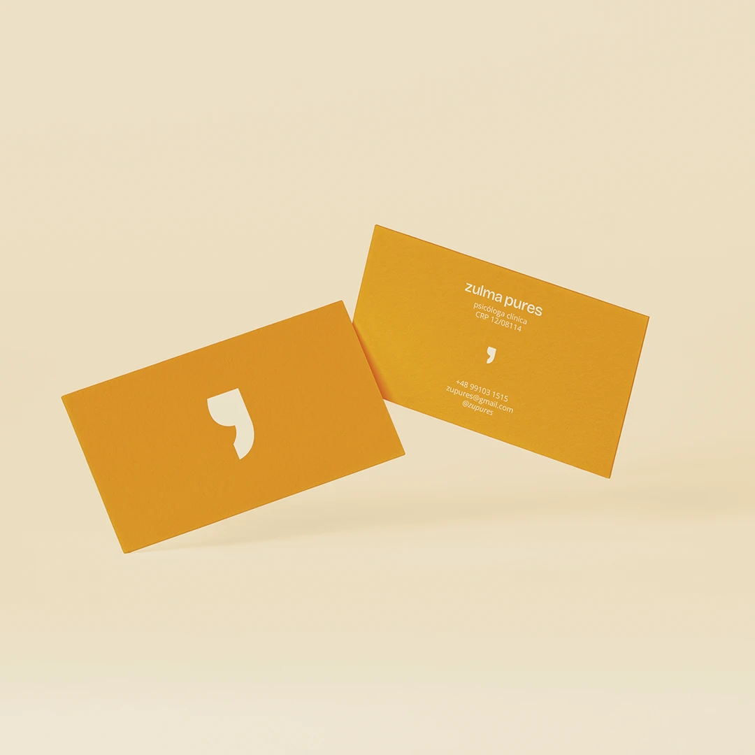
To bring this positioning to life, Fracto developed a minimalist, contemporary and highly sensitive visual identity. Our creative direction set aside traditional clinical palettes and built the project on a strategic color balance: orange brings the energy, youthfulness and approachability of the professional, paired with an earthy brown that grounds the brand and provides essential solidity and warmth.
The project’s greatest conceptual strength, however, lies in the intelligence of its symbol. We adopted the comma as the central element, graphically expressing the true essence of therapy: continuity. In Zulma’s practice, stories don’t come to an abrupt full stop; instead, there are pauses, breathing room and safe reflection that make it possible to move forward. The whole concept was rolled out across refined print materials, delivering a brand that perfectly balances lightness and depth.